


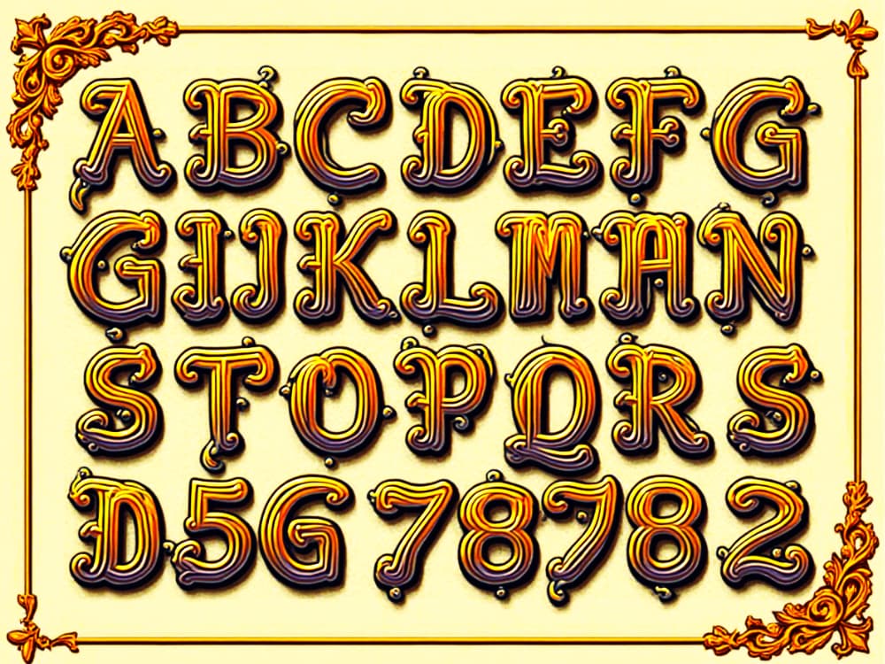
Have you ever scrolled through a website or flipped through a magazine and found yourself captivated by a particularly eye-catching headline? Chances are, you’ve encountered the magic of decorative fonts. These playful and elaborate typefaces, also known as display fonts, have a rich history and continue to shape the world of design today. Let’s dive into the fascinating world of decorative fonts and explore their journey from past to present.
A Brief History: From Quills to Pixels
Decorative fonts have been around for centuries, evolving alongside human communication. In medieval times, monks painstakingly crafted illuminated manuscripts, adorning letters with intricate designs and gold leaf. Fast forward to the 18th and 19th centuries, and we see the rise of ornate Victorian-era typefaces, bursting with flourishes and personality.
The advent of advertising in this period led designers to experiment with typefaces to grab attention. This era saw the birth of many ornamental and stylized fonts used in posters, newspapers, and other printed materials. The Art Nouveau and Art Deco movements in the late 19th and early 20th centuries further influenced the evolution of decorative fonts, pushing boundaries with intricate and elaborate designs.
The digital age brought a renaissance for decorative fonts. Suddenly, designers could create and distribute unique typefaces with ease, leading to an explosion of creativity. From grunge-inspired fonts of the ’90s to the hand-lettered styles popular today, decorative fonts continue to push the boundaries of design.
Practical Magic: When and Where to Use Decorative Fonts
While they may not be suitable for your next academic paper, decorative fonts shine in various applications:
- Logos and branding: A well-chosen decorative font can instantly communicate a brand’s personality.
- Headlines and titles: Grab attention and set the tone for your content.
- Invitations and greeting cards: Add a personal touch to special occasions.
- Packaging design: Make your product stand out on the shelf.
- Social media graphics: Create shareable, eye-catching content.
- Posters and advertisements: Create an eye-catching focal point, drawing viewers in and delivering a message with impact.
- Event materials: From wedding invitations to gala event programs, these fonts add a touch of elegance or fun, depending on the style chosen.
The key is to use them strategically and in moderation. A little goes a long way!
Pros and Cons in the Modern Design Landscape
Like any design element, decorative fonts have their strengths and weaknesses. Let’s break them down:
Pros:
- Instant visual impact
- Ability to convey mood and personality
- Memorable and unique
- Can elevate simple designs
- Expressive: Offer a vast range of styles, allowing designers to set the tone or mood of a project
- Versatile applications: Suitable for various design contexts, from digital to print
Cons:
- Potential legibility issues, especially at small sizes
- May not be suitable for long blocks of text
- Can look dated or cliché if overused
- Might not display correctly across all devices or browsers
- Overuse risks: Using too many decorative fonts in one design can lead to visual clutter
- Trendy nature: Some decorative fonts can quickly become outdated
The Digital Frontier: Decorative Fonts in the 21st Century
Today’s designers have an unprecedented array of decorative fonts at their fingertips. With the rise of variable fonts, we’re seeing new levels of customization and flexibility. Designers can now adjust weight, width, and other attributes on the fly, opening up exciting possibilities for responsive and interactive design.
Moreover, the surge in popularity of hand-lettering and calligraphy has inspired a new wave of organic, authentically imperfect decorative fonts. These typefaces bring a human touch to digital designs, bridging the gap between traditional craftsmanship and modern technology.
Choosing the Right Decorative Font: Tips for Success
- Consider your audience and the message you want to convey.
- Ensure readability, especially for important information.
- Pair decorative fonts with simple, clean typefaces for balance.
- Test your chosen font across different devices and sizes.
- Don’t be afraid to experiment, but trust your instincts if something feels off.
- Use decorative fonts sparingly to maintain their impact.
- Always consider the context: A playful font may be perfect for a children’s event, but not for a corporate report.
- Test for accessibility: Ensure your design is readable for all users on different devices and in various sizes.
Conclusion
Decorative fonts are more than just pretty letters – they’re powerful tools for communication and expression. When used thoughtfully, they can transform a design from ordinary to extraordinary. They offer a fantastic way to inject personality and creativity into your projects, making them truly memorable.
Remember, in the realm of design, rules are meant to be bent (and sometimes broken). The most important thing is to have fun and create something that resonates with your audience. So go ahead, explore the world of decorative fonts, and let your creativity flourish!
Happy designing!


